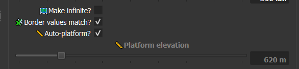
So if you have some amount of boolean values in macro parameters, you will see that they not strait alaigned to the text, but a bit flying above center, like here is scroll or something like that, but here is no scroll and just checkbox. Sometimes it is not comfortable for navigation - text and check box should be on same line, or near each other

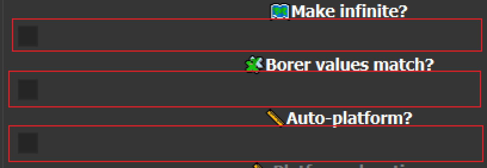
example of fixes:
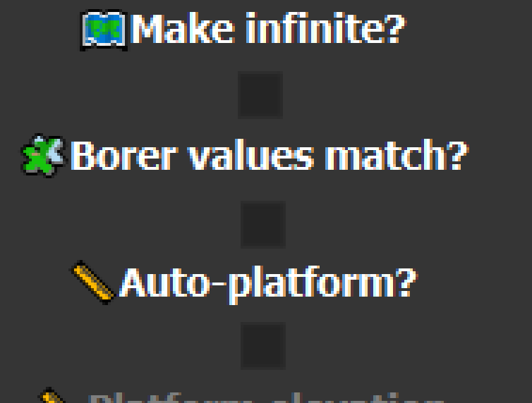

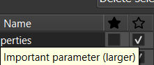
all what i said is related to star marks “primary parameter” “important parameter” - but without them text become too compact, less visible. Also space from border based on length of biggest text, that cause different spacing in not same groups… (picture 3)