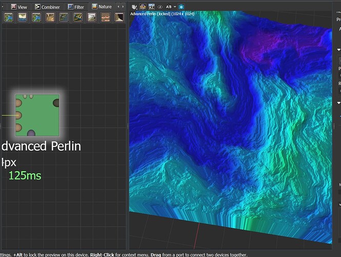
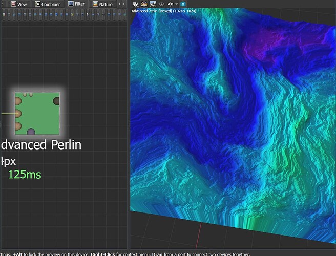
So if you have small nodes window, it quite comfortable to chose nodes from tab above - but not in all cases - Filter devices tab have a lot of them - that makes every icon too small to correctly recognize each
So my idea is to add ability for icons save their visible size, and make additonal line of devices. So Filtar tab will still be big, but just display all divices in 2, 3, 4 lines if needed

