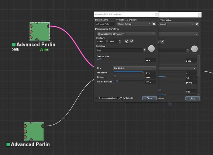
It’s common to have several properties windows open at once, and often they overlap. Double-clicking on a device does bring the related properties window to the front, but it can still be difficult to visually distinguish with all properties windows shaded similarly. Please make it so that whatever device is currently selected in the node editor has its properites window shaded differently than all other properties windows. This could be a customizable preference / color.
1 Like
I like your two suggestions/requests, make sure to also upload them here, so development can be tracked!
Thanks, suggestion added!
1 Like
This topic was automatically closed 365 days after the last reply. New replies are no longer allowed.
