UI remains poor

Hello,

I’ve just purchased an upgrade to latest WM, in hope that the user interface has gotten better, but so far, the experience is mostly disappointing.

While the dark user interface is certainly welcome change, that’s pretty much where the improvements end.

1, WM is now launched alongside a floating console window. This is absolutely unacceptable for any commercial software in 3rd decade of 21st century. Not only is the window messy, distracting and adds one unnecessary click/step when switching windows (which is especially frustrating since WM is a pipeline tool rather than a standalone content creation software, so one switches back and forth quite often), but closing the console window will shut down WM immediately, without any save prompt or warning. This is a significant downgrade from previous WM versions. You can no longer just click on the windows taskbar to switch to WM, you need to also select the actual WM window instead of the console.

Solution:
Floating console window should be off by default, and enabled only for debugging purposes. Closing the console window should not shut down entire software.

2, The nodes still look ugly and are very clumsy compared to any other node based software. In the new version, this is further aggravated by the fact that clicking while the node wire is stuck to the mouse pointer will not launch a search window, which can not even be dismissed by left clicking outside of it, but right click. If possible, hire some UI designer who knows at least basics of HID input to UI interactions.

Solution:
A: Nodes need modern design. A simple, flat design with slightly rounded corners, no Windows 95 bevel effects, circular node slots and properly antialiased rasterized graphics. Node links should be curved by default, which minimizes the confusion of overlapping wires.

B: Floater style modal window should be possible to dismiss by left mouse button clicking anywhere outside them, as is standard in any other software implementing similar functionality.

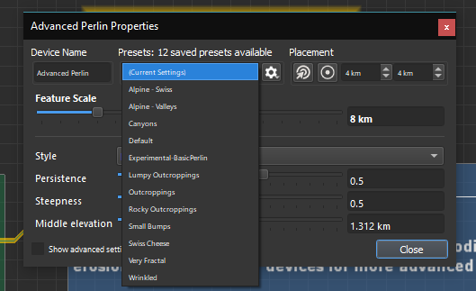
3, Font size is completely over the place. On some parts of the UI, like the left sidebar, some fonts are so tiny they are hardly readable even at 32" screen with 100% DPI scaling.
Here’s an extreme example:
image

Solution:
Use one font size across entire UI.

4, The icons, their design and their quality is definitely not up to date with rest of the UI.

Solution:
Hire someone to update the icons to match the modern UI design

5, While the node properties are finally not modal, and do not block the rest of the user interface, they are still in form of pop ups, which is also not adequate to software standards in 3rd decade of 21st century. In a modern software, one would expect to have a general properties bar, usually on the right, which immediately displays properties of an actively selected nodes, which allows for uninterrupted workflow, instead of having to constantly deal with floating windows covering parts of the user interface.

Solution:
Introduce new properties panel on the right, which always displays the properties of currently selected node. Deprecate floating node properties windows.

6, We can finally have multiple editors within a single UI window, through the new pane arrangement button, however the UI completely fails to communicate to the users how to change the contents of given panes. There’s no border highlight to indicate that the active pane was the last one .

Solution:
Introduce new small UI element (usually a bottom pointing arrow/triangle) to a top right corner of each pane, which opens a named list of all the available pane modes (Device/Layout/Explorer/2D/3D) and deprecate pane switching buttons at the top bar, as it’s not clear to the user which pane is currently being affected.

7, Navigation of the small 3D preview in the sidebar and main 3D view is not consistent. In small one, all 3 mouse buttons change light angle, and it requires Alt key to navigate, while in the larger one, navigation does not require alt key.

Solution:
Input in both of these should be unified. I’d keep the standardized LMB/MMB/RMB navigation, which is great, but would map adjusting light angle to something like Shift+LMB for example.

8, Zooming in 3D views using mouse wheel has a very ugly input lag. The smooth interpolation is way, way too much. I know this is usually intended to smooth out the mouse wheel movement, but here it’s been taken to the absolute extreme.

Solution:
Reduce movement interpolation when zooming with mouse wheel significantly.

9, There’s still that nonsense where node creation is a persistent mode one has to quit out of. In other words, if you want to create a node, and you click to create it, you are still stuck in the node creation mode until you right click to exit it. In almost all cases, this feels like an UI input bug rather than something desired. Amount of cases where user actually wants to create multiple nodes of the same type at the same time is miniscule, so in most cases, this is undesired.

Solution:
Once node is placed the first time, exit the node creation mode immediately.

10, I wanted to write that if user wishes to create multiple nodes of the same type in rapid succession, they can simply perform quick hotkey based copy and paste after initial node creation, but I was in for a nasty surprise, as pasting doesn’t actually paste nodes, but enters a modal node placement, which is also very undesired.

Solution: When paste shortcut is executed, paste nodes immediately under the cursor position. This should never ever be modal. It should align with common sense standards of computer software. This doesn’t happen in any other software.

11, Pane layout does not get saved within the file and is reset every time file is reopened. This kinda defeats the purpose of having customizable UI layout.

Solution:
Remember UI layout changes.

These are just a first few impressions. I will try to post more once I come across them.

I really hope at least a few of these can be implemented, so that we can finally stop using WM as the textbook example of a good software (in terms of under the hood tech) spoiled by poor UX and UI, which has been the case up until now.

Thank you.

4 Likes

I have to agree with you for the most part. The separate console window is a bit of clutter. I actually quite like the new UI, but it feels almost half finished. I’m not a huge fan of the click and drag connectors. It can feel a little bit clunky, and could be streamlined. I absolutely have to agree with you on the icons. They need to be modernised. I do think there’s a lot of good with changes too. The dark mode was a breath of fresh air, and being able to open multiple view ports is great. But most of all, the search function is an incredible time save.

1 Like
  1. I agree with this, the extra console window is indeed annoying but I mostly use WM 90% in my work pipeline so there is little to no switching for me.
  2. My personal solution would be adding multiple node styles similar to Gaea, with possibly a legacy version and the “updated” version. I personally like the newer, flat node styles, but it’s down to personal preference.
  3. The font is a good size for me, except for the presets font where it is so small I can read it but barely.
    I agree to boost the font size a little or at least add an option to change the font size.
  4. Going back to #2 of my list, adding the new icons but as a separate theme would be nice.
  5. I don’t really care about the popups, but indeed a properties bar would be nice.
  6. Agree with this as well.
  7. I personally don’t touch the small 3D window as it is too small to effectively use and rather use the multiple view window.
  8. Another preference option for this would be nice.
  9. I think this should stay as I usually put multiple nodes at once and it would be far more annoying to constantly click back and forth, this could also be another option in the preferences menu.
  10. Also for preferences, as I like this mode better than the one suggested.
  11. This would be good, and I also would like this implemented.

A quick suggestion of my own, I’d like nodes that have randomizable settings to be randomized per placement like pre-LTE, as currently in LTE it places the exact same seed in every for example, Advanced Perlin.

1 Like

Regarding 8 and 10, I understand that you don’t want the workflow to get slower, but having node creation and duplication modal is honestly not much faster. It results in clumsy workflow as it’s kind of an odd mode which you have to exit out of once you are done.

I think you should open WM and try to make some terrain from scratch and try how many times do you actually want to create multiple nodes of the exact same type at the same time. I’d be surprised if it made up above 10% of all the node creations.

To be clear, what I am proposing is to have something like UE4’s node duplicate hotkey, which simply instantly duplicates the node selection under the mouse cursor, making duplicating newly created nodes very rapid:

And in WM, of course, I’d expect that if you are duplicating just one node, and duplicating it while hovering over highlighted wire, the node would be automatically connected through that wire.

This should ultimately allow rapid node creation and duplication without need for the sticky modal state.

2 Likes

Ah, I see what you mean, yea this would be a great addition to World Machine!

1 Like

Lots of great points are being addressed here! I have to admit that a lot of these annoyances go unnoticed when using the software for so long, and having a more tabula rasa perspective is much needed.

Regarding:

  1. Agree, this should be off by default, I think it is just left on without giving it a second thought, not something that was intended to remain there forever. Especially the accidental closing of the debugging window bypassing the “save changes” prompt is a big no.
  2. A. Comes down to taste, WM would greatly benefit from custom skins/themes (:eyes: hint). I think the nodes are clear and really distinct, but again, that may be because I’m so accustomed to them. Gaea’s nodes look very messy imo, and the gradient used in the nodes from your UE4 vid appears really cheap imo, but again, that comes down to taste, not a big deal. As for the wires, I find curved wires way more confusing and less appealing than the WM approach. Comes down to a personal preference, and being able to choose the wire rendering style would be great.
    B. Right click is the overall “cancel” in WM, and changing this to left click would break that language. That said, why not both?
  3. Fonts are disastrous, especially the bitmap fonts used for the devices. The example shown is, if I were to guess, not meant to be like that and is probably missed before release of this update. I would suggest using the Inter font and to use a consistent font sizing.
  4. Again, preference, needs a theme. I can see why long term users would like to use the current icons. That said, I totally agree the icons need an overhaul.
  5. Comes down to preference once again, but also because I’m used to it. Especially on a ultrawide or multi monitor setup it is annoying to always have to go to the right side of the screen. This should, again, be optional.
  6. Great point. Border highlighting would be great to have. The proposed UI element feels unnecessary as we already have the big buttons at the top, the F5-F9 shortcuts and RMB->view pane option. It would be extra clutter of the screen.
  7. Agree.
  8. Agree, too much of it, but again, you also get used to it after a while (same for smooth scrolling in certain applications like FireFox).
  9. This should be a preference. I use this function all the time, especially in macro development, and the “right click to cancel” is so heavily baked into my mind, I don’t even think about it. I do understand why it is annoying if it’s the only option available.
  10. Same as above, being able to use one hand instead of having to use a two button shortcut (CTRL+V) together with mouse motion is a much nicer experience to me. Again, comes down to personal preference.
  11. 100% agree.

The main purpose of the LTE update is to enable these UI changes. For now, it is “just” an update to a new framework with some additional work flow improvements. The UI is still far from picture perfect, but I’m sure it will be updated to today’s standard.

3 Likes

I agree with the possibility of custom user-made themes, as this would open up a lot of customization.

I second that notion.

To clarify:

2, Custom themes are only a good thing if they are done properly. It can be done in absolutely horrible manner, like it is case with Blender, where creating a custom theme takes roughly 8-12 hours. Most people only care about roughly 3 things:

1, Brightness/Darkness - Each person prefers different
2, Accent color - Some people like and dislike certain colors
3, Plasticity - some people like gradients and shadows while other prefer modern clean flat look

That’s it. Everything else should be handled under the hood to ensure consistent design language. There’s a proposal on UE4 forums about UE4 theme improvement which nails it perfectly I believe:

But I would much rather have no theme customization than something like the horrifying theme customization Blender has. There definitely should never ever be as granular theme settings as node specific settings regarding shapes and styles of nodes alone.

People generally feel a need to customize themes only if the default themes are ugly. Look at the substance painter for example. The theme is so nice and clean no one really ever requested theme customization for Substance Painter, because the out of the box one is just good.

For example, here is an UI concept Pablo Vasquez has made for new Blender geometry nodes:


If WM’s node look was at this level, I really doubt anyone would feel a need for a significant degree of customization.

(Just to prevent further debates, I am referring just to the visual style of the nodes, not to a mechanical functionality. I am aware that WM has different node mechanics where the inputs can be also at the top and bottom of the nodes. I am not proposing for that to change.)

Curved VS straight wires is certainly something that I expected to be a preference. I would definitely not suggest removing straight wires, just adding curved as an alternative option.

And clicking outside search box to dismiss it. Of course! I did not mean that adding ability to dismiss it with LMB click outside it would remove the ability to dismiss it with RMB click. Obviously :slight_smile:

4, This is not about location of the properties bar, but about the concept of floating window vs a docked sidebar. Since new WM UI system is customizable, there is absolutely no reason you should not be able to dock the properties bar anywhere you want, when you can already do that with the “Project sidebar” that is on the left.

6, It’s not that simple. The big buttons at the top make no sense because it is not immediately obvious which pane will they affect. Having per-pane content selector is also a standard in most other software out there. Each pane should have its own UI element, but the element should be very minimalistic and not distracting. Function keys to switch are not a solution either. They should remain, but they are not discoverable for the new users. And RMB works only half of the time only in half of the pane types.

9+10, Yes I agree this could remain an option. The issue is that this is only comfortable for people who have used WM for a long time, or it’s the only specialized software they use. That’s rather minority of people. Most people use WM alongside other software, in a pipeline, because it’s really tough to produce anything that pays the bills with just WM alone. And defaults should always accommodate as wide portion of the userbase as possible.

4 Likes

Offt. Dat UI. Yes please.

A post was split to a new topic: Missing lofting curve editing

There are many good suggestions here that I will take under advisement. A number of them, such as improved icons, better viewport management, etc, are all planned already.

Build 4015 is not the endpoint of World Machine evolution. It is, in fact, the start. Now that WM is targeting a better framework, GUI changes are actually possible. 4015’s primary goal was to reimplement in the new framework while picking up some easy wins along the way. Anything that didn’t specifically have to be rewritten was mostly left alone for this release - for example, the device workview.

With all that said, I do also believe a number of these suggestions are more individual taste than anything else. I’m happy to poll the userbase and see what the majority of users prefer, but with limited development resources I only really want to change matters of taste if an overwhelming majority prefers something a certain way.

3 Likes

No, most of them are simply a matter of a proper UI design, not a taste.

Every single of those suggestion would be improvement for the better, not the worse. (If implemented the way I clarified in my subsequent posts).

WorldMachine has always had a reputation in the industry as that one software with incredibly poor UI and UX, and the “I only really want to change matters of taste if an overwhelming majority prefers something a certain way.” kind of attitude will ensure this stigma will continue for at least another decade.

What you are failing to realize is that these, what you may consider a “minor quirks” are additive, and add up to the overall horrible, dreadful experience.

Really, the only thing you have going for yourself is that up until recently, there was no proper alternative for WM. But I can’t remember a single time I was able to just use WorldMachine, and enjoy it, without the UI standing in my way and making it frustrating experience throughout.

At the same time, this is not any kind of anecdotal law - I mean that every software has to be a bad experience. I use many different pieces of software for my job, and WM is really an outlier in terms of the dread it causes to one when using it.

Lastly, if the aforementioned changes are difficult because limited development resources, then all hope is probably lost. Design aside (UI theme and Icons, which you should not be doing anyway if you are a programmer, but outsource to someone with proper skillset for those), majority of the proposed changes are minor UI/input behavior tweaks, which should be trivial to change, especially now, given that WM has migrated to Qt UI framework, which has more than sufficient infrastructure to accommodate for those. So if these relatively minor changes (which should not take more than a week of work) already become real struggle in terms of development resources, then I can’t really see how WM could ever sustain reasonable pace of development, especially for the actual important features.

I agree with Stephen that some of these are a matter of taste, not “proper UI design”. Some of these I do agree with and would help my own experience with World Machine, such as the shortcut to duplicate the last-placed node and eliminating the floating console window. Other things, such as updating the icons to look more “modern” are down to preference, and if the icons suddenly changed I would be immensely confused as to which is which.
As Stephen said, “4015’s primary goal was to reimplement in the new framework while picking up some easy wins along the way. Anything that didn’t specifically have to be rewritten was mostly left alone for this release - for example, the device workview.” This hints that many changes are going to come to World Machine, and I’m pretty excited for that. Stephen also explicitly said that some features that you suggested are already planned and will be released. I agree that a poll for some of these features would be good as again, some of these are down to preference.

2 Likes

I think an overhaul of the UI/GUI could definitely improve WM. Maybe even to the point of getting more revenue. Bundle that up with a reworking of the website, official one at that. And you’d be looking at a whole new piece of software. I genuinely believe it would help WM…

1 Like

UI was OK before and now is even better, I really see no problem there. UI is the last thing I would think about when thinking about improvemets for WM. For professional user the most important feature is “productivity”, which can be translated how fast you can iterate (in this case render time), because you spend 2 percent of time in UI and 98 percent waiting for renders (you need to tweak small details in higher resolutions, which is usually 8k+). One of the last updates improved some devices and now my projects are rendered 30-50 percent faster, which brought tremendous value. So improvements should be mostly focused this way (gpu usage?), faster artist can iterate, the better. No matter how you can tune UI, you cant simply get there more value (there is no big space for improvement in that 2 percent of UI time…).

1 Like

You literally could not be more wrong. The poor UI is one of the main reason iteration times in WM are so abysmal.

@Rawalanche I agree with you that a poor UI is a very important factor when it comes to easing and speeding up a workflow. However, do mind we all have personal differences. I know enough people who still hold on to using the command line interface instead of windows explorer (or the file interface of linux for that matter), and in that case, it comes down to how much you are accustomed to the situation/given interface. And especially if 98% of your time is taken up by rendering, as @Demostenes mentions, I can see why someone would much more prefer performance updates over UI improvements.

Nonetheless, I agree with you on this subject, the UI of WM still has a lot left to be improved. However, not every user needs a smooth as butter UI, and that’s also important to keep in mind.

The bottom line is that never in my life have I seen more consensus that a specific computer graphics related software has a terrible user interface than in case of World Machine.

Sure, there are certain pieces of software with divisive UI design, be it Blender, Zbrush, etc… But in those cases, you can often see two relatively proportionally sized camps of people who either like it or dislike it.

In case of WM, the amount of people in the dislike camp is overwhelming, and it’s not just a “dislike” camp. In this case it’s flat out hate camp. I am talking mainly about professional community, where both efficiency/workflow speed as well as output quality matters to people a lot. I don’t have many ties to the hobbyist WM community, so I have no clue what the situation and mood is like over there.

The argument that it’s a matter of opinion is generally true, but WM in this case is an exception which proves the rule.

WM is node based tool. Unless you totally remake whole philosophy of this tool, there is nothing you can do. How do you want to connect nodes faster? Also this node based approach have its advantages, you can simply do anything you want unlike in tools, which have classical UI. Once you do more complex project, you will find out, that these classical UI tools are great for fast prototyping, but there se SO MUCH issues, once you want to do something specific a and tune small details for FPS/3rd person game.
WM take lots of time to learn, but once you manage it, you find out, that there is nothing on the market, which can substitute it (for example because of tiled build, current games have usually under 0,5m per pixel resolution, so you often need 32k+renders). And also you will have no problem to start using other node based tools, it is more or less the same.
My projects have usually hundreds of nodes and still UI time is absolute nothing in compare to waiting for render. In several days I have more or less everything done and than I spend several months to tune details (render wait).
Regarding better productivity, it would be nice to have some production quality presets library (complete bioms), this would help starting new projects. I would also welcome some dune device, but this has nothing to do with UI.